

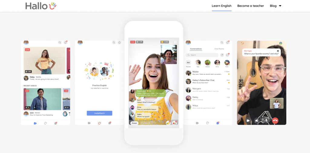
Hallo is a live streaming platform for language learning. At the click of a button, users can watch live classes from native speakers 24/7 and start a conversation with a practice partner via real-time via video chat. Hallo brings the fun back to language learning and makes it the social experience it was designed to be.
Hallo officially joined RevRoad on January 1, 2019.
Product Development
One of the first steps the development team took was to build an MVP to help Hallo meet their launch deadline of January 1, 2019.
Minimum Viable Product (MVP)
RevRoad’s development team was crucial in helping HALLO build an MVP that launched in April of 2019. Since launch, Hallo has become a force to be reckoned with. With RevRoad’s help, Hallo had over 300k app downloads within their first 6 months while spending $0 on ads. In addition, they average around 2.5M monthly viewers. The app has revolutionized the way people learn languages.
Capital
A big challenge Hallo faced in its early months was the lack of capital.
Seed Fund
Upon joining RevRoad, Hallo was in dire need of funds to support its activities and expenses. While partnered with RevRoad, Hallo was able to raise close to 1M in seed funds.

Brand Refresh
One of the first steps the marketing team took was collaborating on a rebrand.
Logo
Hallo had undergone three logo designs to land to the perfect and most suitable logo for their industry. View the before/after of the Hallo logos below.
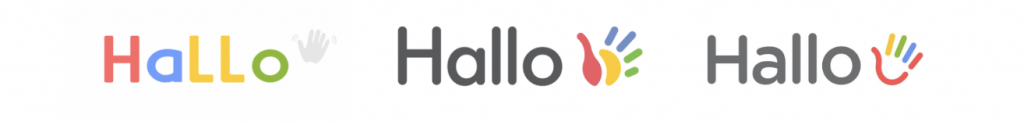
As you can see, the initial logo color was bright and playful. This presented the mood of Hallo as young and elementary. With RevRoad’s suggestions and input, the revamped and final logo highlights all of the strongest features of the first two logos, yet the changes made helps solidify the overall tone of the brand. With these changes, Hallo is better able to compete in the language learning industry and secure a space in the consumers’ minds.
Icon
In addition to the logo redesigns, RevRoad helped revamp the icon as well. Below is a picture of the before/after.
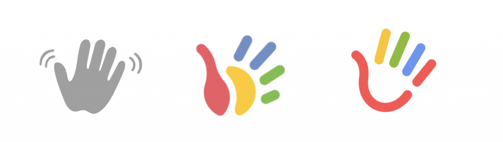
As you can see, the initial icon was dull and didn’t capture the audience’s attention in addition to being unfitting of the brand. The second icon was close to the industry’s fit, but however, still had some ways to go. The third and final icon proved to be a perfect fit for the industry in giving hallo the best chance to compete. The new and final logo is bright, personable and fitting of the overall brand tone.


No comment yet, add your voice below!